See Part 1 before diving in. We have downloaded the UPenn GBM MRI scans and the clinical data from TCIA. Let’s take a look at the clinical data to get an understanding of the patient cohort.
Exploratory Data Analysis
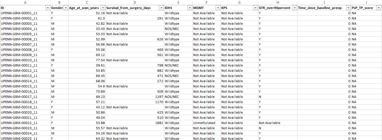
Let’s look at our patient cohort in a bit more detail. I first opened the CSV file in Excel/Google Sheets to see what it looks like.

Each patient has an unique ID. Their Gender and Age at the time of the MRI scan is listed. If available, the number of Days they survived after surgery is shown. Some patients do not have this information listed as potentially the authors were not able to contact them or collect this information before the study ended. The next two fields show the mutational status of isocitrate dehydrogenase (IDH-1), and the presence of the O6-methylguanine-DNA-methyltransferase (MGMT) gene, both of which are strong biomarkers for GBM survival prognosis. We then have the Karnofsky Performance Status (KPS) score. This is a qualitative score from 0-100 that indicates the ability of the patient to perform daily activities and self-care. A KPS score of 0 means the patient is deceased. Taken together, this clinical data can help us train a survival model that can predict a patient's Overall Survival (OS).
Finally, let’s write some code to analyze the clinical data. We will need some basic understanding of the clinical data so we can structure our MRI scans the right way for segmentation model training.
Login to your Google account and go to https://colab.research.google.com/
Open a new notebook (File —> New Notebook). At the top left, rename your notebook to upenn-gbm-eda.ipynb.
Let’s mount our Google drive so the files are accessible from our Colab notebook. After running the code below, follow the pop-up prompts to select “Connect to Google Drive”, choose your account name, and click on the “Allow Access” button in the pop-up.
# Mount Google drive

from google.colab import drive
drive.mount('/content/drive')
Now let’s import some basic Python analysis and visualization packages
import pandas as pd
import matplotlib.pyplot as plt
import seaborn as sns
Read the clinical data using Pandas. Replace the file path to the CSV file with your specific directory structure if it is different from mine. Path is case sensitive.
upenn_gbm_clinical = "/content/drive/MyDrive/UPENN-GBM/NIfTI-files/UPENN-GBM_clinical_info_v1.0.csv"
df = pd.read_csv(upenn_gbm_clinical)
You should see something like the picture below.

We can see that the file has 671 rows and 10 columns. But from the dataset description, the patient cohort included 630 patients. So where are the additional records coming from? If you look at the image closely, you can see that certain patients had multiple scans (suffix of 11 and 21 in the ID). By looking at the data, we can further observe that the second scan, where exists, was taken later than the first (by looking at the age at scan column) and has more information than the first. But how do we get the actual number of distinct patients? Since each patient ID ends in either 11 or 21, we can remove these final 3 characters and then get a unique count of patients, like so -
# Remove the last 3 characters from each patient ID, store it in a new dataframe, and get the number of unique values

patients_df = df.ID.str[:-3]
patients_df
patients_df.nunique()
We have 630 patients, which matches the number in the paper.
Let’s run some basic Exploratory Data Analysis (EDA) on the clinical data
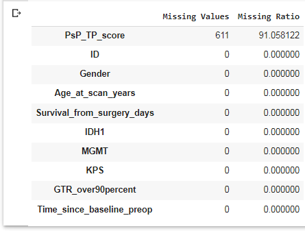
# Check for Missing data
missing = pd.DataFrame({'Missing Values':df.isna().sum(), 'Missing Ratio':((df.isnull().sum()/len(df))*100)})
missing.sort_values(['Missing Ratio'], ascending=False).head(10)

We see there are no missing values in any field except the Progressive Supranuclear Palsy/Tumor Proportion (PSP TP) Score, which is similar to KPS score in assessing patient disability. We will not use this field in our analysis.
Check the number of unique values in each field
df.nunique(axis=0)
For the categorical variables (fields those that signify a category, such as Gender), we can see what values are present in our data. For example, even though KPS is a number, each value defines a category, such as 100 = Normal, no complaints, 90 = Able to carry on normal activity with minor signs of disease and so on. We can plot a simple bar plot to see the values and counts. You can see that most of the patients do not have a KPS score (Not Available), which limits the usefulness of this field for prognosis. You can create similar plots for the other categorical variables.
df['KPS'].value_counts().plot(kind='bar', xlabel='KPS', ylabel='Count', rot=0)
Now that we have a basic understanding of the patients in this research, we can begin the setup for training our deep learning segmentation model. Read about it in Part 3.
